Having an inclusive, go-to spot for all things related to your podcast—including podcast merch—is just one benefit to having a podcast website. Whether you’re just starting a podcast and wondering which website builder to use, or upgrading your site to include premium content, review these examples of exceptional website design and listener-focused elements to create a podcast website that stands out.
What Every Podcast Website Needs

While podcast websites vary from each other in visual style and structure, they generally share key on-page SEO elements that should be functional, engaging, and well-optimized (e.g., keywords, site structure). Creating a top podcast website means providing easy access to repurposed content and maintaining a seamless user experience. Here are some of the most important things every podcast website should have:
- About Page: Provide an overview of the podcast’s purpose and what listeners can expect. Good About Us page examples typically show host profiles, including their backgrounds and expertise.
- Search Functionality: Websites should be simple to navigate and have a search bar that allows users to find specific episodes by searching via topic, tags, or keywords.
- Show Notes: Detail descriptions with show notes, which can provide summaries, key points, links to resources mentioned in episodes, and more. This provides value for listeners and offers more opportunities for podcast SEO optimization.
- Social Outreach: Social media and email links amplify your podcast, making it easy for listeners to ask questions and provide feedback to hosts.
- Monetization Efforts: Easy-to-discover merchandise, premium members-only content, and providing premium subscription links to major podcast platforms (e.g., Apple Podcasts, Spotify, Google Podcasts) allow you to advertise your podcast while growing a paid subscriber audience.
- Podcast Episodes: Every good podcast website should have an embedded podcast player, as well as an episode list and download options for listeners to discover more content.
- Responsive Design: Websites should be optimized to work well on various devices and screen sizes, particularly mobile, to accommodate all listeners.
Top Podcast Website Examples
The best podcast websites demonstrate your show’s personality and enhance users’ enjoyment with thoughtful design and navigation features. Here are some of the best examples of podcast web design and why they work.
99% Invisible
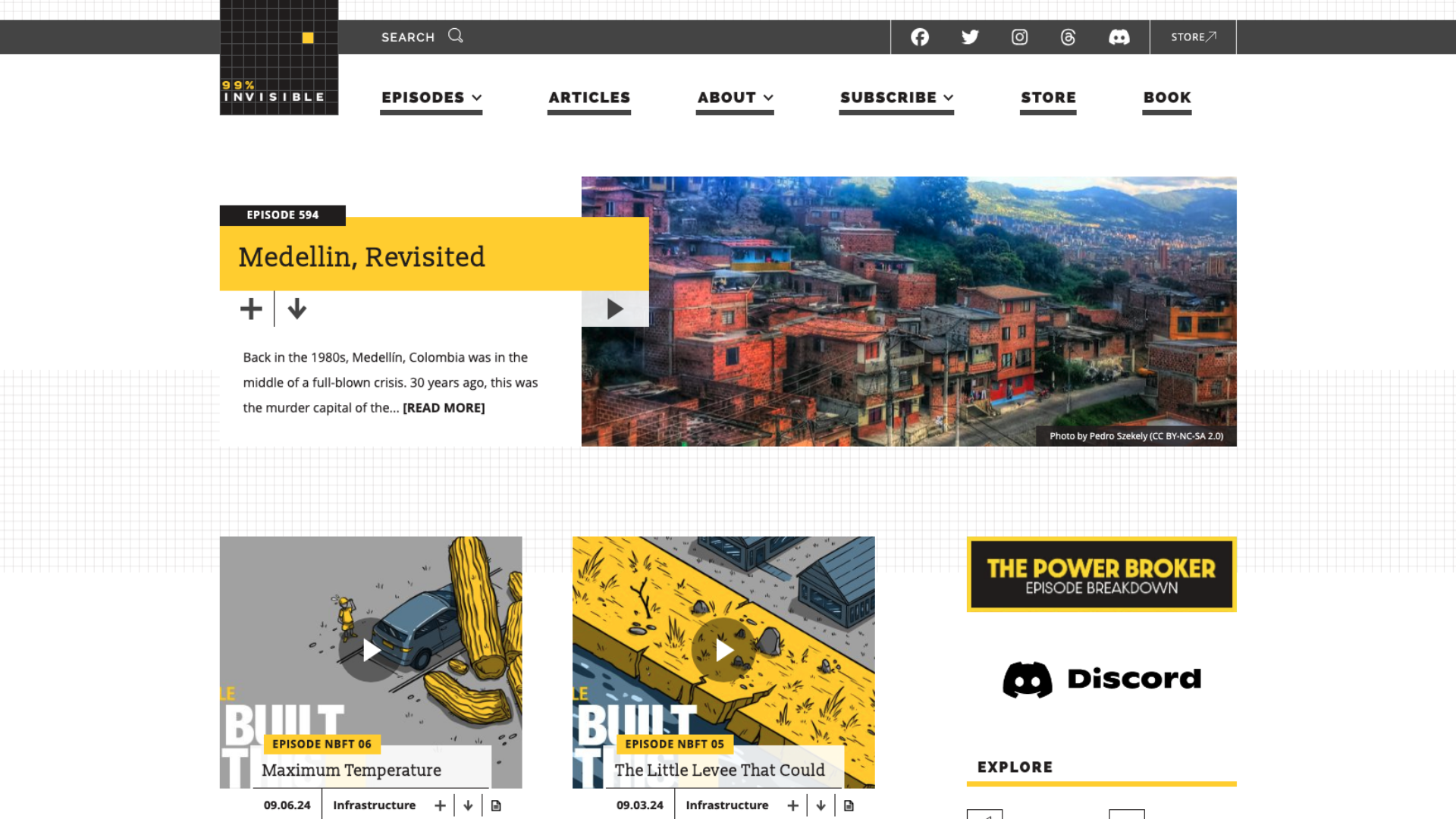
Website Builder: WordPress
Hosted by Roman Mars, 99% Invisible explores the overlooked aspects of design and architecture that shape our world. Their architecture podcast provides insight into the hidden influences behind everyday objects, spaces, and built systems. This website reflects that philosophy, utilizing a well-organized hierarchy and sensible structure for podcast pages.
Key Takeaways:
- The homepage offers single-click access to podcast episodes, categories, social media links, and more.
- The site manages to build a distinct and visually appealing black/yellow color palette into their entire website, encouraging brand continuity across the whole site.
- Each page features a navigable, grid-based structure and responsive buttons.
What Could Be Improved:
- Page Design: While 99% Invisible utilizes white space well, the right side of each page—especially on individual episode briefs—has dense white space below the fold that could be used for additional links or a CTA.
All My Relations

Website Builder: Wix
All My Relations, led by visual storyteller Matika Wilbur, centers on the representation of Native peoples in mainstream media. The podcast aims to challenge stereotypes and share authentic Native stories. Their website complements this mission with calming visuals, beautiful artwork, and a collection of informative content.
Key Takeaways:
- The homepage is decorated with eye-catching episode art—which, when selected, takes you to the episode and presents links to resources mentioned.
- Almost everything is available on the first page, including episodes, merchandise, social media links, and an AMR newsletter—a fantastic email marketing tactic for podcasts.
- The site features a pastel color palette that’s warm, inviting, and matches the show’s tone.
What Could Be Improved:
- Page Speed: The homepage’s automated slideshow moves a little too quickly for comfortable reading, yet lags when a user clicks to the next slide.
Being Boss
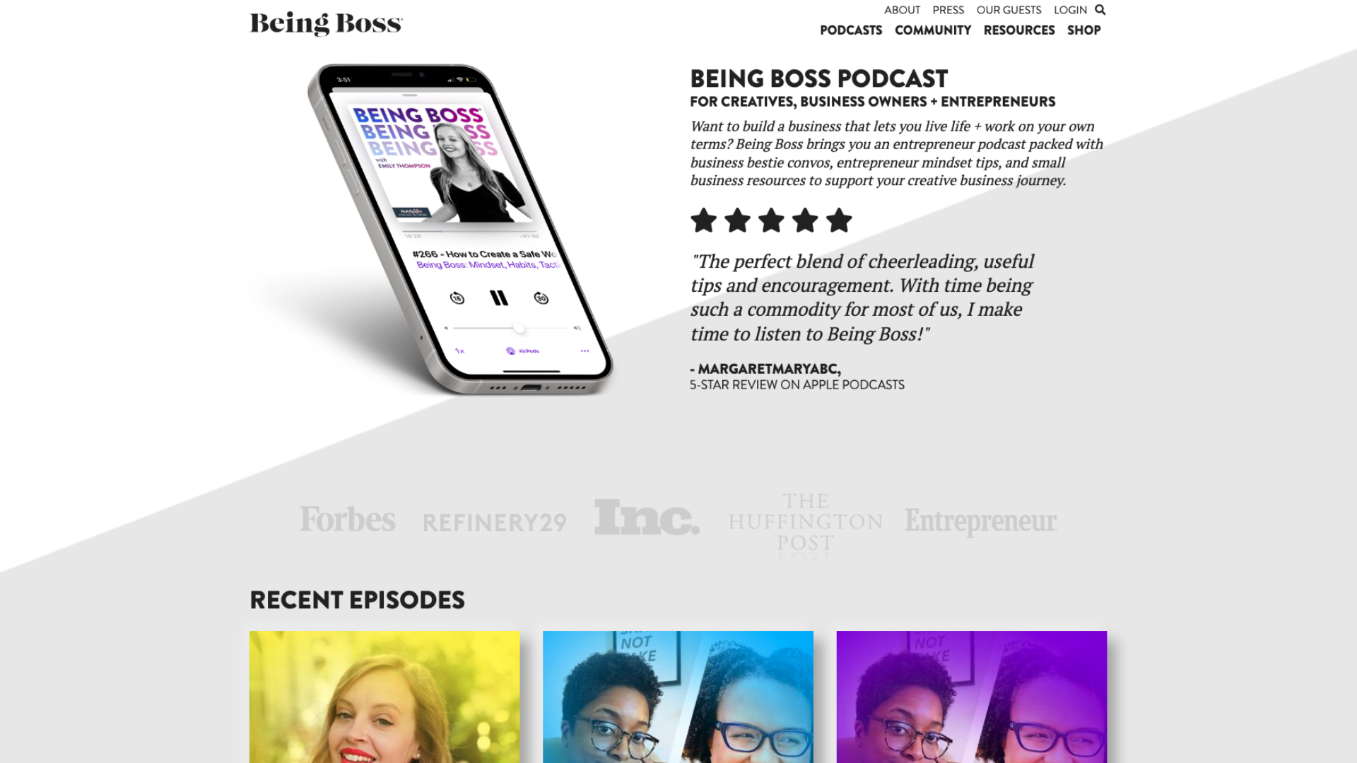
Website Builder: WordPress
An award-winning podcast for entrepreneurs, Being Boss offers self-care and management advice to millions of freelancers and business owners. Its website highlights the podcast’s established reputation and popularity, placing its brand authority front and center.
Key Takeaways:
- Includes a page for small business resources, including courses, books, and a searchable query.
- Utilizes social proof by showing a 5-star review and the logos of Forbes, The Huffington Post, Entrepreneur, and more that Being Boss was featured in.
- Allows users to browse episodes based on guest appearances.
What Could Be Improved:
- Strategic Page Design: The homepage dedicates a lot of space to a single review, and is unclear on whether they’ve been featured in an article or endorsed by the companies whose logos are on the site. While they do feature recent episodes, the homepage’s extra space could be used instead to promote useful business resources, upcoming events featuring the host or previous guest speakers, and other social media links for entrepreneurs.
Crime Junkie
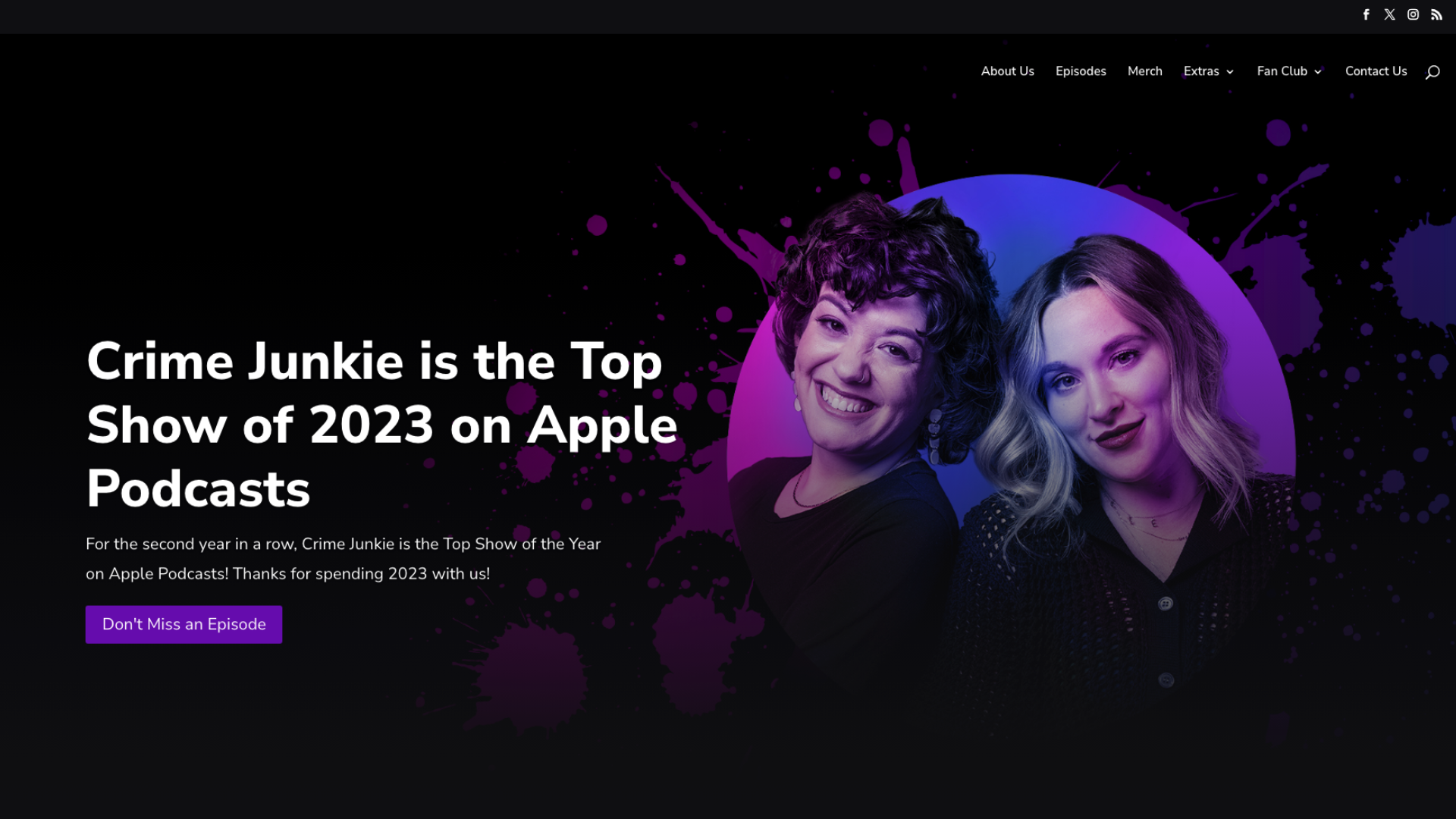
Website Builder: WordPress
Crime Junkie, a weekly true-crime podcast hosted by Ashley Flowers and Brit Prawat, ranks among the most popular podcasts in the U.S. The show explores a variety of cases—from mysterious deaths to wanted fugitives—presented in a clear, informative style. Its dark-themed website is neatly assembled and makes information easy to read.
Key Takeaways:
- Features a modern podcast page design with a black/purple scheme and invisible button prompts.
- Displays partnered organizations and highlights contributions to victims’ families to promote education and advocacy.
- The Extras tab provides additional info and fosters engagement with promo codes, fan art submissions, and insider updates.
What Could Be Improved:
- Page Navigation: Make it easier to find evidence and other additional resources for the investigations discussed on the show.
Criminal
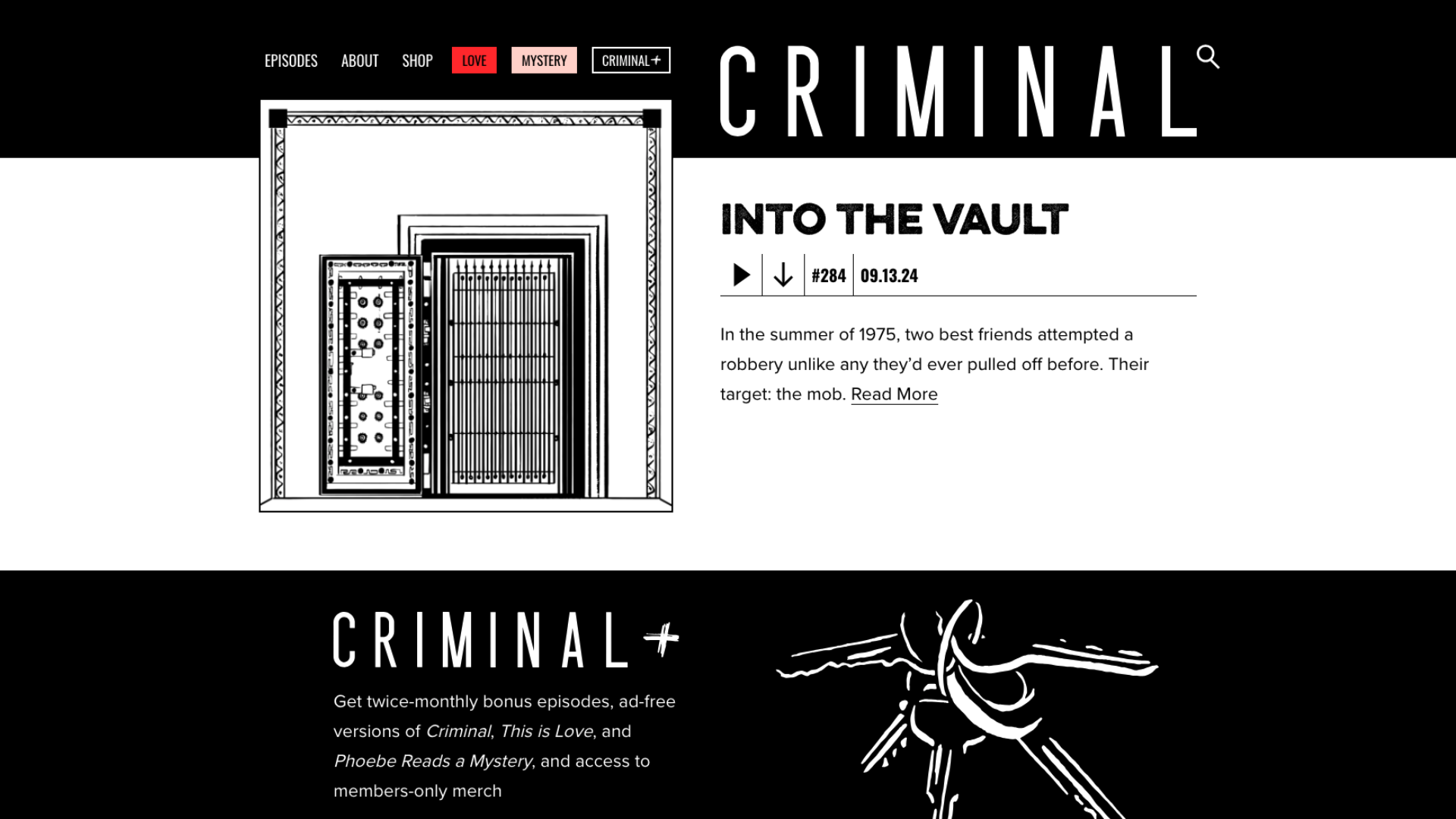
Website Builder: WordPress
Started by Phoebe Judge, Criminal is a long-running true crime series that covers intriguing cases worldwide, discussing how the actions of criminals impact those associated with and affected by them. The website’s monochromatic color palette is visually engaging and features detailed, hand-drawn art reminiscent of police sketches.
Key Takeaways:
- Utilizes a primarily black/white color palette and adds custom art for each episode title.
- Every episode is accessible from the website, including podcast show notes and full transcripts.
- Promotes “Criminal+” for ad-free listening.
What Could Be Improved:
- Site Structure & Navigation: Adding a refined search system and filters that allow users to start from the podcast’s first episode without scrolling through every subsequent one.
CTRL SHIFT!
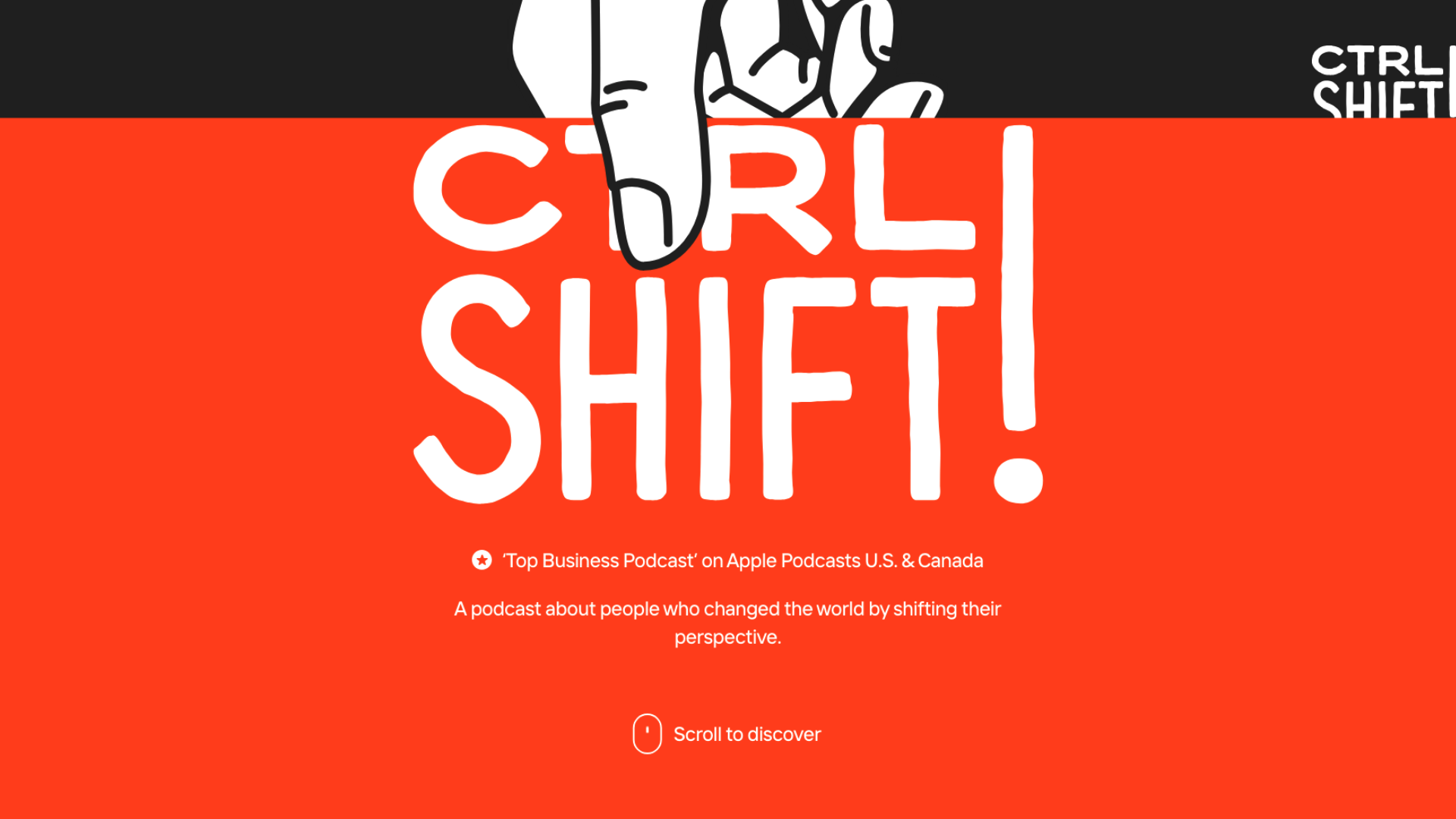
Website Builder: Custom
CTRL SHIFT!, hosted by Anatoliy Gromov, is a top business podcast focused on how prolific individuals became successful by shifting their perspectives. Examples include how game theory can be applied in medicine, how career shifts happen in the design world, and how journalism translates to the world of poker. This trendy, innovative theme can be recognized in their website, which utilizes a custom-made, responsive home page with motion graphics.
Key Takeaways:
- Provides responsive website design with clickable, scrollable buttons that react to the user’s movement
- Showcases a sleek and modern style that distinctly reflects the podcast’s branding.
- Podcast episodes are faithfully represented with impressive animated graphics.
What Could Be Improved:
- Page Design & Site Speed: There’s a lot of visual clutter and moving elements that could be better optimized for slower systems, especially for scrolling through pages.
- Content: Provide more information about the show’s goals and theme with an About page.
Dear Gabby
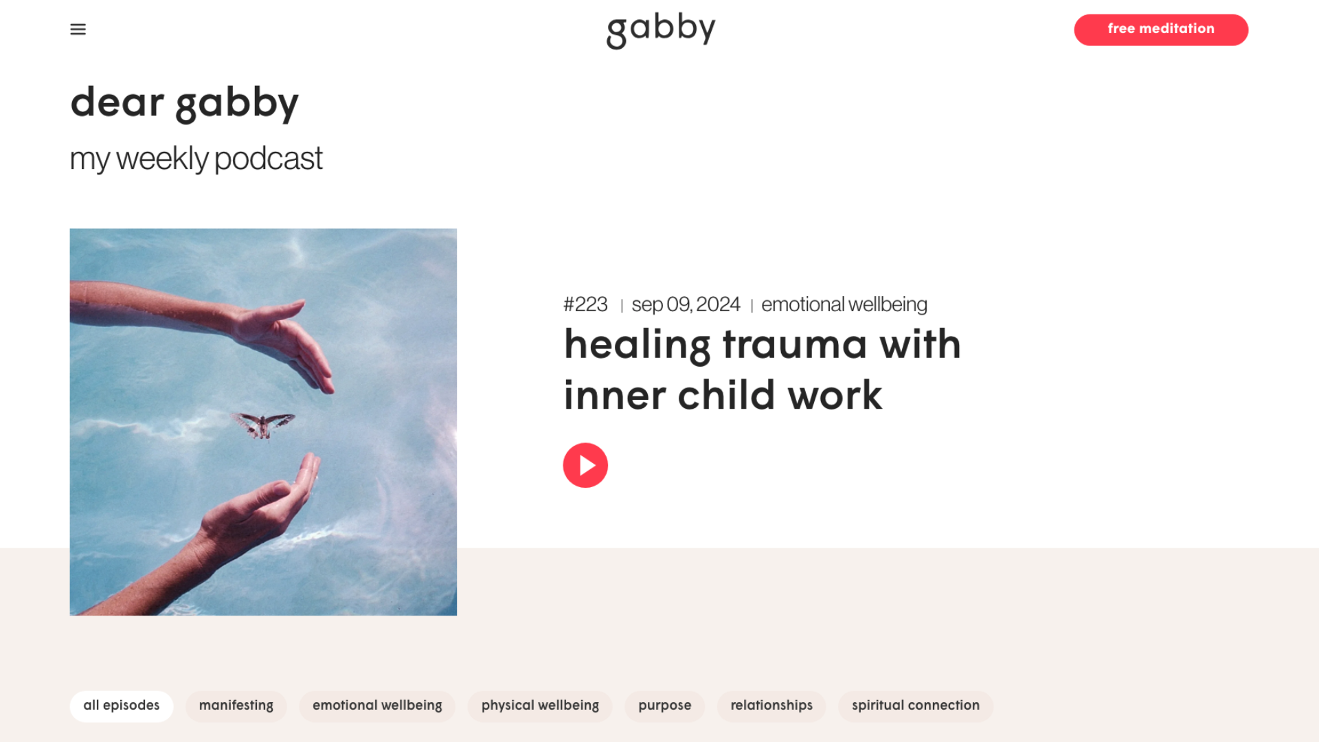
Website Builder: WordPress
Dear Gabby, hosted by well-known author and motivational speaker Gabby Bernstein, is a mental health podcast about personal development, spirituality, and self-help. Each episode offers listeners guidance and inspiration on various aspects of their lives. It boasts a calming, minimalist web design that focuses on providing useful information without overwhelming visitors.
Key Takeaways:
- The website’s clean and well-organized aesthetic aligns with Bernstein’s brand and message, creating an inviting atmosphere for visitors.
- Its intuitive layout makes it simple for users to find and access various sections, such as episodes, show notes, and additional content.
- Features several clear calls-to-action, including to Bernstein’s coaching app, weekly newsletter subscriptions, free meditation programs, and best-selling books.
What Could Be Improved:
- Audience-Driven Content: Dear Gabby‘s site could implement more user-focused elements, including listener polls and surveys on weekly topics or Q&As between Bernstein and her audience. Because this podcast already relies on some audience interaction, encouraging more types of interaction can boost engagement and keep listeners on the website.
Deck the Hallmark
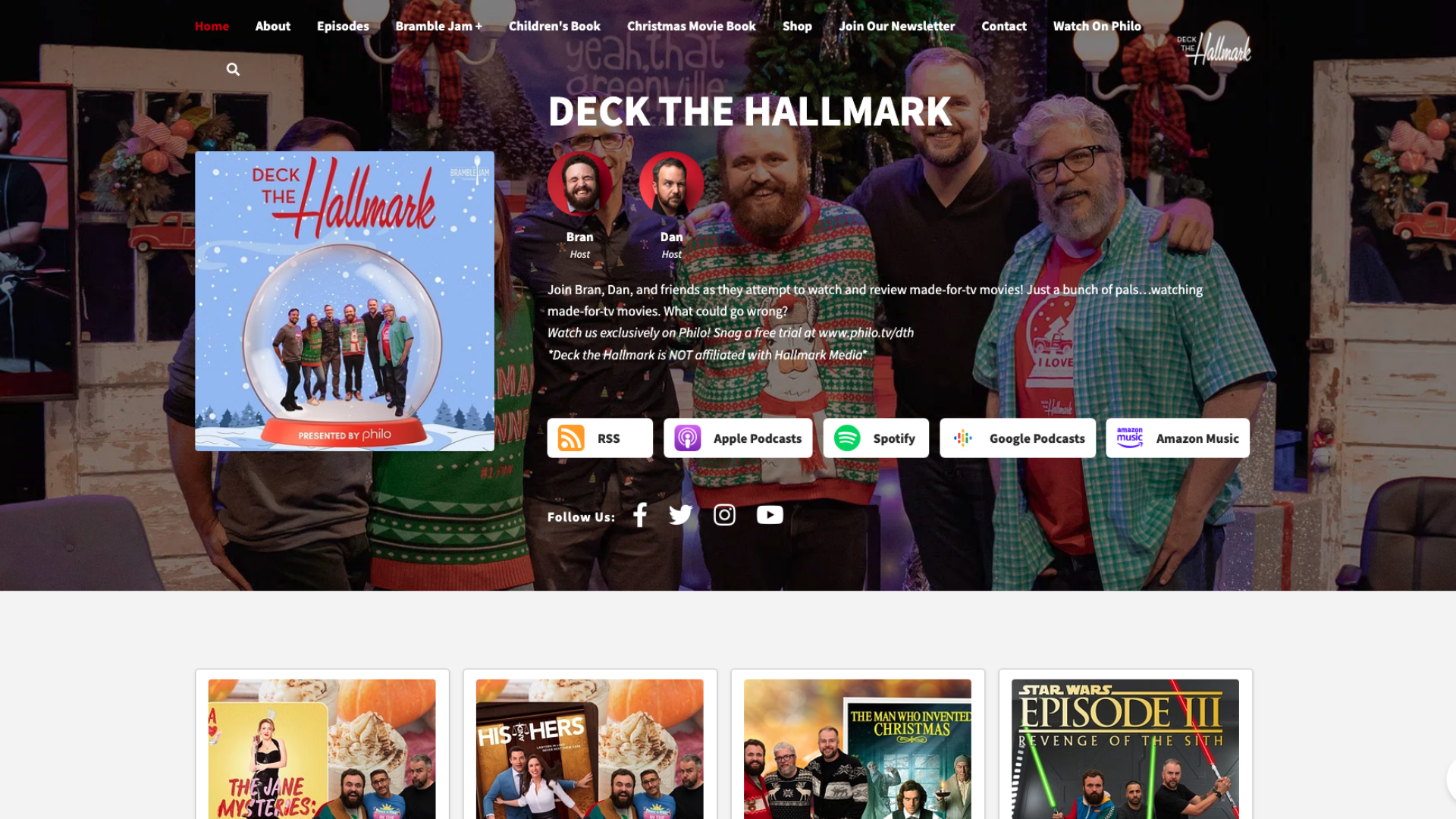
Website Builder: Podcastpage.io
Deck the Hallmark is a podcast that explores and reviews Hallmark Channel movies aired during the holiday season. Hosted by Bran, Panda, and Dan, Deck the Hallmark is known for its humorous and critical take on made-for-TV content. Their podcast site is fun and simple, with episode thumbnails reinforcing holiday vibes with snow globes and Christmas sweaters.
Key Takeaways:
- An embedded episode player allows website visitors to navigate and listen to episodes.
- Easily browse important host info, including profiles, social media links, and contact information.
- Search bar links to holiday-specific podcast merchandise like Christmas books and ugly sweaters.
What Could Be Improved:
- Brand Reinforcement & Visual Interest: The website’s color palette, branding, and visuals are lacking. It could take more of the “Hallmark holiday” or Christmas aesthetic to feel more distinct and engage visitors.
- Content: Add show notes to give an idea of episode topics before tuning in.
Flash Forward
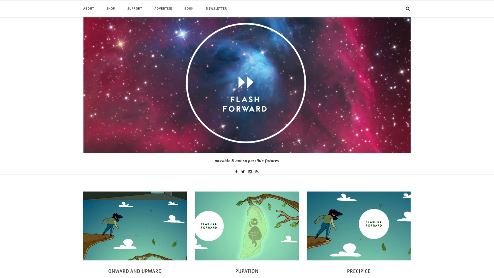
Website Builder: WordPress
Flash Forward, hosted by Rose Eveleth, delves into speculative scenarios—from technological advancements to shifts in societal norms—and considers how such scenarios might transform the world, including topics like artificial intelligence, space exploration, and changes in human behavior. Its website portrays the podcast’s unique feel with cosmic and otherworldly visuals.
Key Takeaways:
- The website’s clean design makes it easy to parse the podcast’s futuristic and speculative themes.
- Its straightforward layout allows users to find episodes, merchandise, and other sections without confusion.
- Show notes typically include detailed summaries, key points, guest information, and relevant links.
What Could Be Improved:
- Website Structure or Content: Adding a blog or articles section could provide deeper insights into the topics covered in the podcast, offering additional value and intrigue for listeners.
Floodlines

Website Builder: Custom
Produced by The Atlantic and created by Vann R. Newkirk II, Floodlines is a documentary-style podcast that centers around the aftermath of Hurricane Katrina (2005). The podcast provides a deep and nuanced retelling of the disaster and its long-term effects on New Orleans and its surroundings. Scrolling down through the website is a guide to each episode, correlating with a timeline of events as it relates to Katrina.
Key Takeaways:
- Tasteful animated visuals that correlate to each Floodlines episode’s topic both attract potential listeners and—if the listeners have viewed Guardian content before—serve as brand reinforcement, as they are stylized similar to visuals featured in the publication.
- Top-down, scrollable web design makes navigation straightforward and mobile-friendly.
- The ADA-compliant website offers a link to episode transcripts, which is a great way hosts can increase podcast accessibility!
What Could Be Improved:
- Content: Add primary sources like at-the-time news articles, images of artifacts, or further research documents and interviews for listeners who want a more in-depth look at the circumstances around Hurricane Katrina.
Forward Obsessed
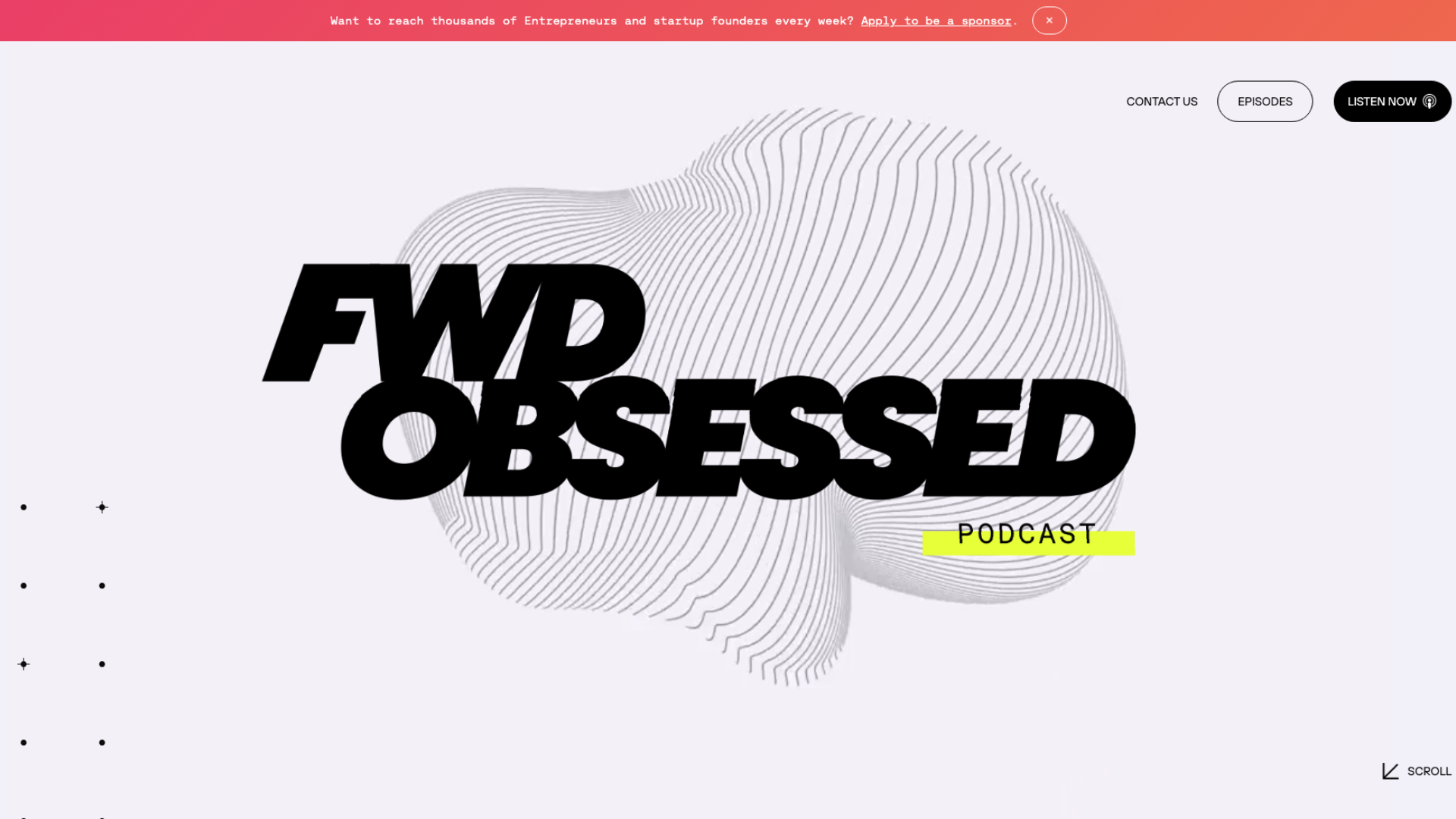
Website Builder: Webflow
Forward Obsessed discusses the intersectionality of personal development, professional growth, and forward-thinking strategies. The podcast explores how entrepreneurs can embrace unique ideas and proactive approaches to achieve their goals and navigate challenges. Its website comprises abstract graphics and responsive imagery that reflects the forward-thinking and innovative nature of the podcast.
Key Takeaways:
- The homepage features sleek fonts, Contemporary color schemes, and a visually appealing look.
- High-quality images and media elements are animated, mobile-friendly, and track mouse movement, enhancing the website’s dynamic feel.
- Includes a comprehensive list of podcast episodes with detailed transcripts and video-based options.
What Could Be Improved:
- Entertainment & Site Structure: Offering more interactive features like polls, surveys, or discussion forums would help keep listeners engaged and gather feedback from other entrepreneurs.
Freakonomics
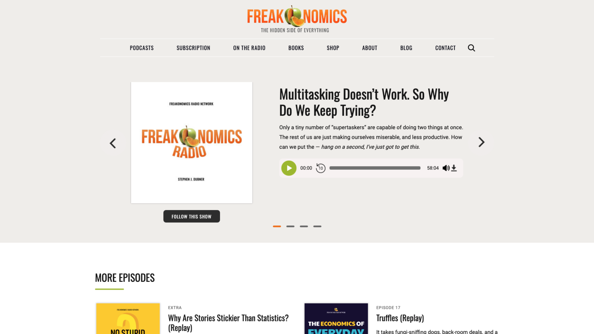
Website Builder: WordPress
Freakonomics Radio—based on the non-fiction novel by Steven Levitt and Stephen Dubner—explores the hidden aspects of everyday life and societal issues through the lens of economics and behavioral science. The podcast applies economic principles to everyday subjects like naming children, parenting, and multitasking to uncover surprising truths. Their website employs a clean, professional design that aligns with its approach to breaking down complex economic concepts into accessible content.
Key Takeaways:
- Maintains consistent branding with the Freakonomics logo and color scheme across almost every page, creating a cohesive and recognizable visual identity.
- Includes links to a wealth of additional content, such as blog posts, research articles, and the original book’s release.
- Links similar podcasts in its in-house podcast media network so listeners can find more topics they’re interested in—and stay on the website.
What Could Be Improved:
- Page Design: Freakonomics Radio is accessible in multiple media formats, and it uses its website for other radio shows, so the podcast itself comes across as mid to low priority. More homepage focus could help it feel distinct.
Niche Podcast

Website Builder: Squarespace
As its name suggests, Niche Podcast centers around people’s unique interests. Hosted by several individuals, the podcast often features interviews with entrepreneurs who passionately pursue their fields, including eSports, windsurfing, rodeo announcing, and more. The website neatly categorizes episodes so visitors can discover interesting topics at a glance.
Key Takeaways:
- Episode pages include guest profiles that cover who the speaker is and what topics they’ll be discussing, sending E-E-A-T signals to Google.
- The About page lists detailed host profiles—great trust, authority, and expertise signals— and explores their various niche interests, playing into the show’s theme.
- Additional content, like unaired segments and related podcasts such as Residual Culture, foster extra engagement.
What Could Be Improved:
- Brand Reinforcement: Eliminate unnecessary white space and add design elements (like logos or backgrounds) more representative of the show’s fun, hobbyist vibe.
Office Ladies
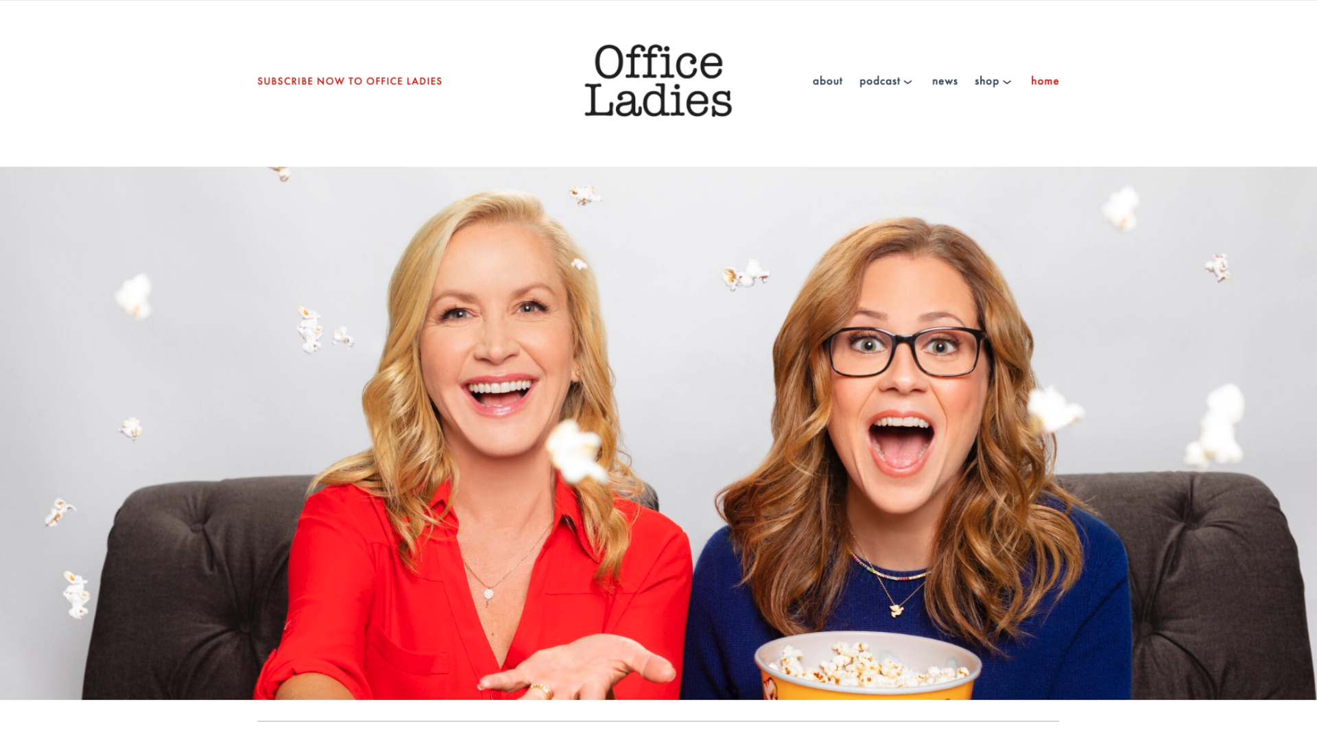
Website Builder: Squarespace
Office Ladies is hosted by Jenna Fischer and Angela Kinsey, also known as Pam Beesly and Angela Martin on the popular TV show, The Office. Their podcast provides a behind-the-scenes look at the show with insider stories, cast interviews, and episode rewatches. The website is easy to navigate and has a clean visual style that lifts fonts and palettes directly from the show.
Key Takeaways:
- Features listener polls, feedback sections, and Q&A opportunities to help engage listeners
- Includes complementary content such as blog posts, behind-the-scenes photos, and bonus materials.
- Integrates plenty of monetization options to support the show, including subscriptions, books, and merchandise—even advertising regular bundle sales.
What Could Be Improved:
- Site Navigation: Adding advanced search filters (e.g., by guest, topic, or episode number) could help users find specific content more easily, especially with a large episode count.
Off Menu
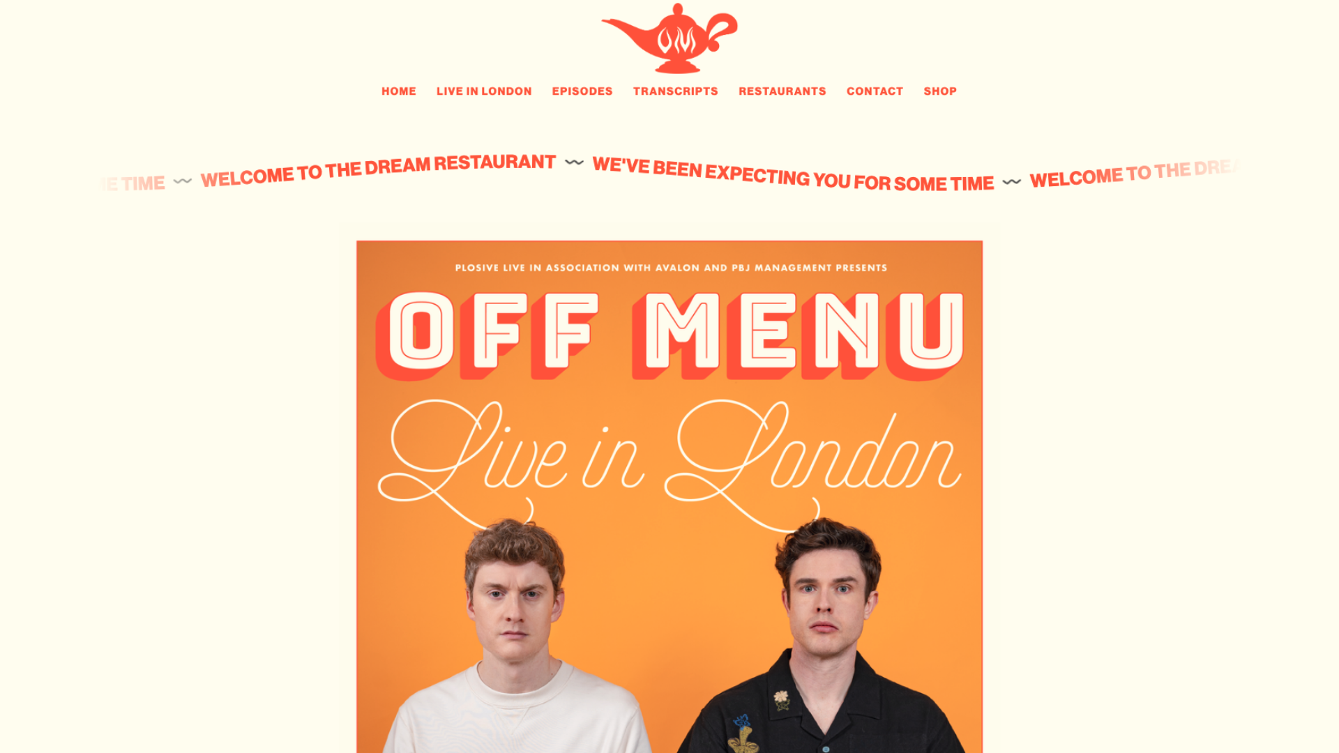
Website Builder: Squarespace
The Off Menu podcast is a popular show hosted by UK comedians James Acaster and Ed Gamble. It blends humor with food talk by inviting celebrities from various fields to their “Dream Restaurant” to select a starter, main course, side dish, drink, and dessert while discussing their work. Organized much like a restaurant page, their podcast website lists transcripts, locations, and episodes in an easy-to-digest way.
Key Takeaways:
- The website’s design and color scheme are vibrant and engaging, reflecting the show’s fun, laid-back vibe.
- An interactive map tracks each restaurant featured on the podcast and lists who their guests were.
- Implements quick monetization links, including tickets to live London shows and access to a dedicated merchandise website increases user-friendliness on the website.
What Could Be Improved:
- Content: Podcast episode descriptions could feature guest profiles or quick show notes so people can view a summary without having to download and read full transcripts.
- Site Design: Add an About page to better explain what the show is about.
Serial

Website Builder: Drupal
The Serial podcast, hosted by Sarah Koenig and owned by The New York Times, is a compelling investigative journalism series. Typically released in sets, Serial dives into one true crime story each season. Its website is designed to reinforce the show’s professional and journalistic method with various informative media, including documents, artifacts, and videos.
Key Takeaways:
- Each season is neatly organized with episodes presented in chronological order. Episode pages often include detailed show notes, summaries, and after-show updates.
- Stylish, yet functional visual design provides a mobile-friendly page structure with clear menus that match the show’s tone.
- The built-in audio and video player are well-integrated and hassle-free, allowing listeners to stream episodes from each page.
What Could Be Improved:
- Site Navigation & UX: Make it easier to find and view resources like case documents, transcripts, or supplementary materials so listeners can easily follow the podcast’s investigations.
- SEO & Relevancy: Redirect the main URL (https://serialpodcast.org/) to its homepage, and feature the acquisition in a designated area near the fold with NYT branding on the homepage. This is a great idea for a module that calls Serial‘s listener base to subscribe to the newspaper.
Shameless Acquisition Target

Website Builder: Squarespace
Shameless Acquisition Target, hosted by Laura Meyer, is about how podcasts make money. Meyer investigates how big-money podcasts make deals while pitching for investors to “buy her show out” through tongue-in-cheek advertisements. With the inclusion of giant resource links and monetization plugs, the website pokes fun at the heavy-handed nature of podcast marketing.
Key Takeaways:
- Currency symbol backgrounds and scrolling banners screaming “Give Me Money” are a humorous, character-filled way to reinforce the podcast’s money-centric message.
- Bold color palettes and an in-your-face homepage easily draw visitors’ attention.
- Encourages listener retention with Social links, merch, and a contact form encourages retention of listeners as well as keeping them on the actual website.
What Could Be Improved:
- Site Navigation & Design: Add a menu with a detailed episode list, About page, and author history. Shameless Acquisition Target‘s homepage could also improve with the addition of a module that allows site visitors to stream or preview podcast episodes.
SmartLess
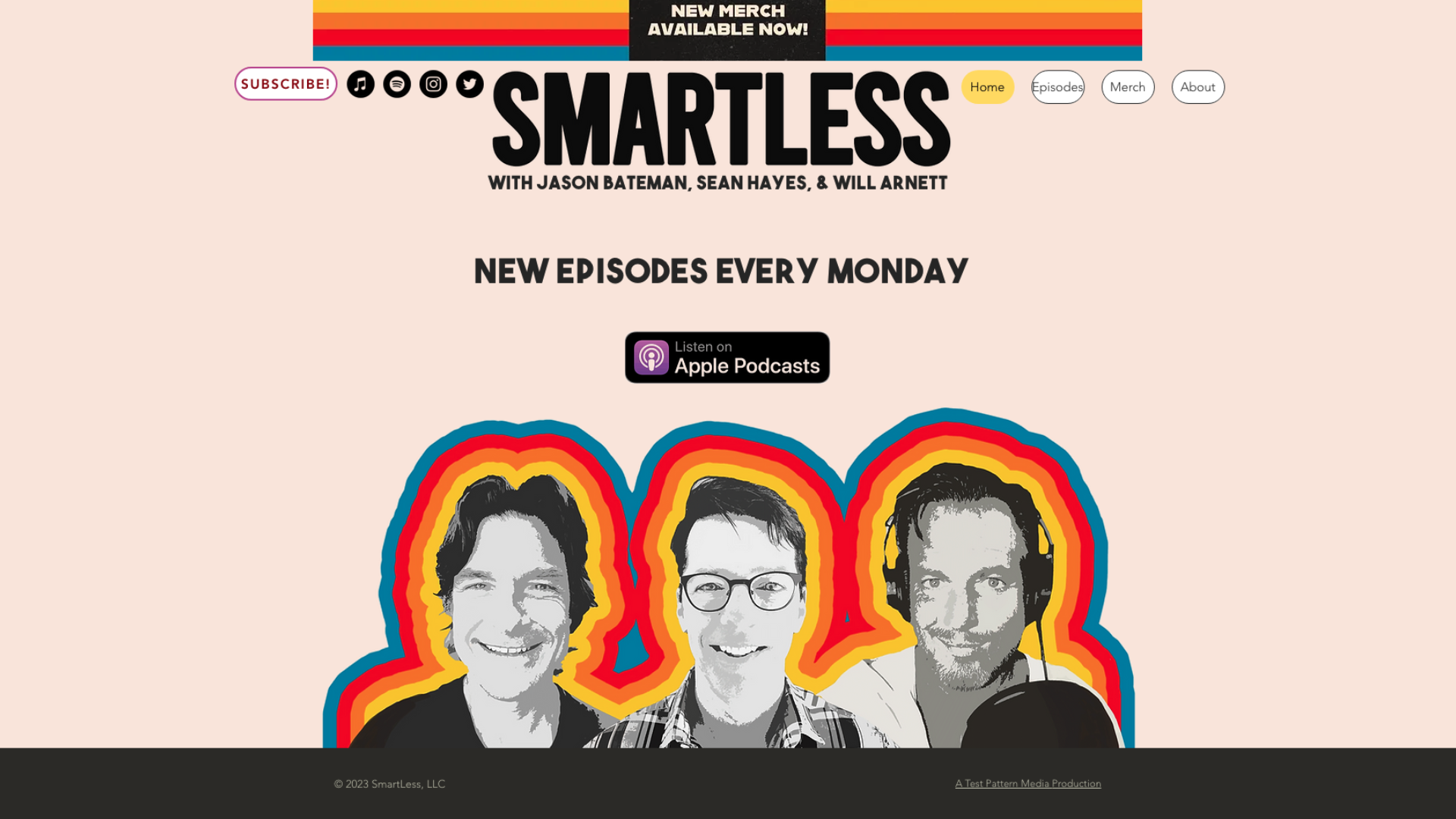
Website Builder: Wix
SmartLess, hosted by actors Jason Bateman, Sean Hayes, and Will Arnett, is a popular talk show podcast that invites guests from various fields like entertainment, politics, sports, and more. The show is often lighthearted and filled with witty banter and humorous conversations. The podcast site emphasizes the presence of its hosts and the show’s enjoyable, organic tone.
Key Takeaways:
- A button navigation system makes it easy for listeners to find episodes, host information, and merchandise links.
- Each episode previews the guest’s name and conversation topics so listeners can find their favorite options.
- Social media links and clear calls to subscribe to the podcast are linked on the homepage.
What Could Be Improved:
- Content & Audience Outreach: Offer listeners opportunities to engage meaningfully with hosts through Q&As, contact forms, or podcast newsletters.
Talking Sopranos
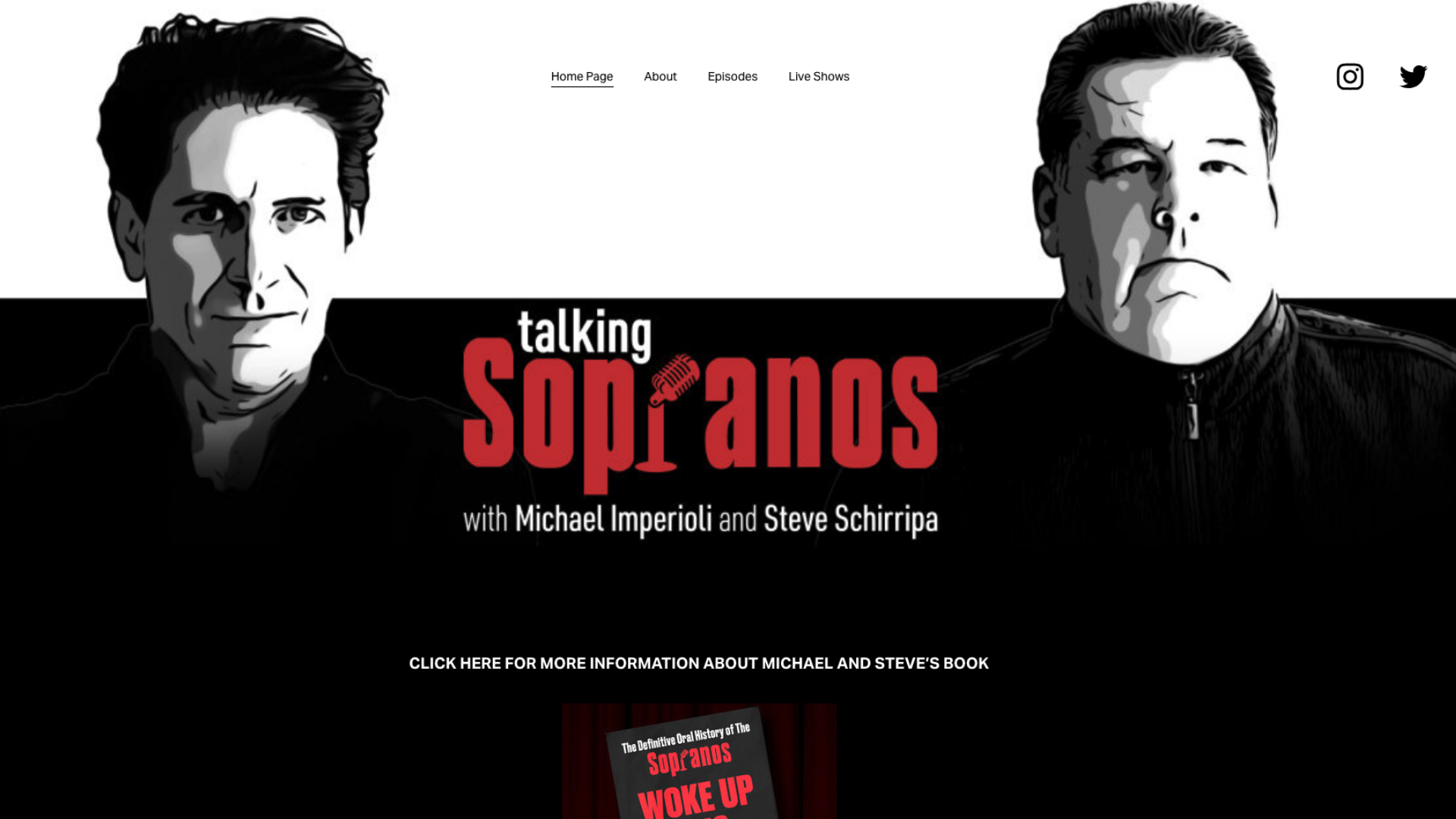
Website Builder: Squarespace
Talking Sopranos is a podcast hosted by Michael Imperioli and Steve Schirripa, who portrayed Christopher Moltisanti and Bobby Baccalieri on the critically acclaimed TV series, The Sopranos. The podcast delves into specific episodes, offering detailed discussions, behind-the-scenes stories, character analyses, and reflections on the show’s impact with appearances from the cast and crew. Their website complements the content with fonts, colors, and imagery that evoke the series’ vintage mafioso look.
Key Takeaways:
- The built-in episode player is simple, well-designed, and categorized by season.
- Homepage CTAs to podcast merchandise and other projects for fans like the hosts’ book and Imperioli’s album keep returning and new audience members engaged with the website.
- Big buttons and bold fonts make the podcast website easy to navigate on desktop and mobile.
What Could Be Improved:
- Optimized Content: Though the site’s design is straightforward and easy to use, the copy is minimal and lacks optimization for search engines. Episodes could be listed with additional content like host/guest profiles and detailed show notes to enhance listener experience, help increase exposure, and provide E-E-A-T signals.
The Fantasy Footballers
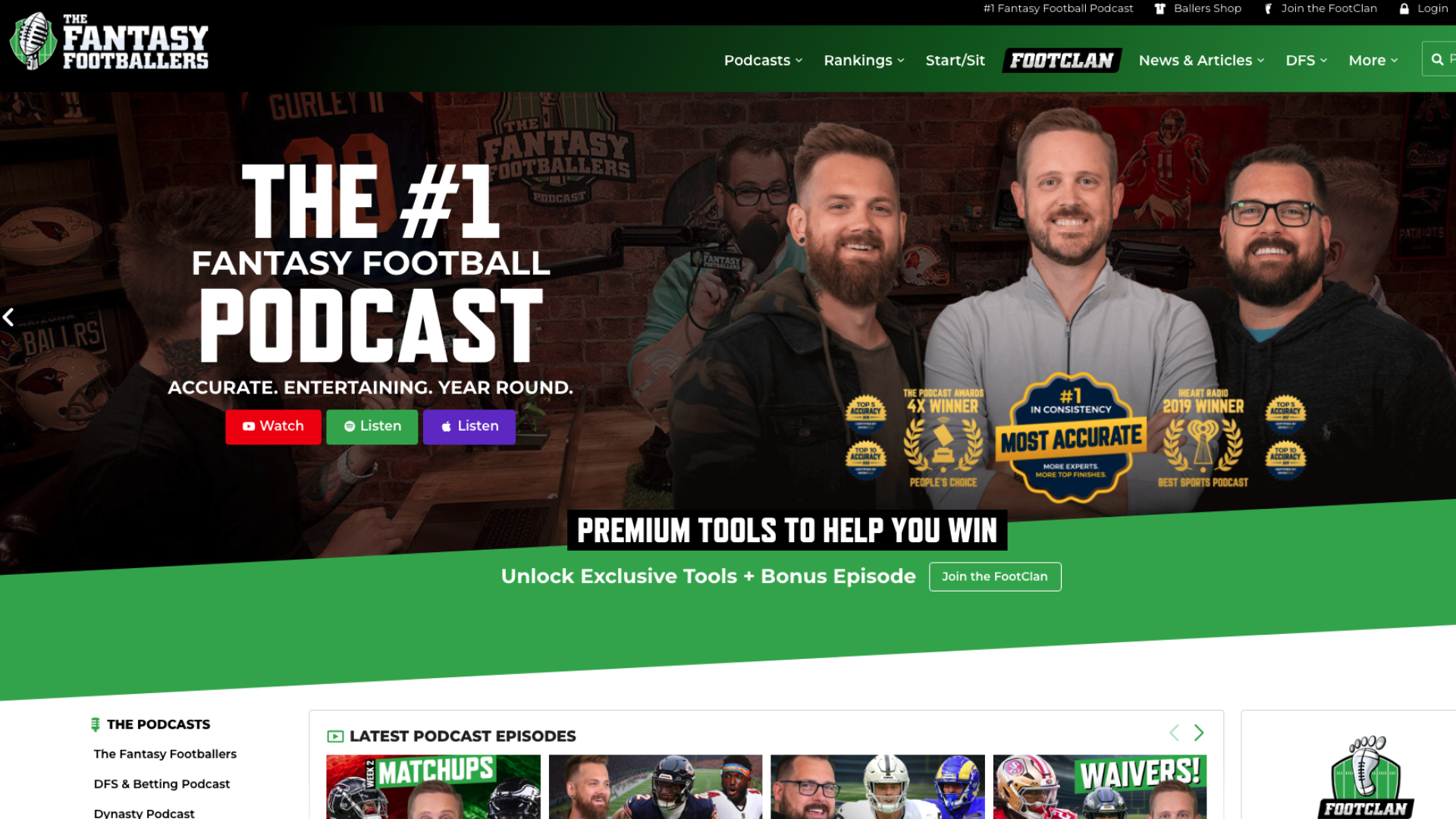
Website Builder: WordPress
The Fantasy Footballers is an entertaining show about all things fantasy football—especially discussions on NFL players’ game and practice performances as draftable players for fantasy team managers. Hosted by Andy Holloway, Jason Moore, and Mike Wright, the podcast provides insights, analyses, and advice to help fantasy football enthusiasts make informed decisions about their teams. In addition to hosting individual episodes, their website is a useful source for fantasy football-related information and statistics.
Key Takeaways:
- Weekly rankings of players by position (QB, RB, WR, etc.), so listeners can stay updated as fantasy managers.
- Relevant links to (internal) articles and important player news fosters continued site engagement.
- Their website promotes membership to their FootClan program, which helps podcast monetization and offers tools for fantasy fans.
What Could Be Improved:
- Website Design & Page Structure: The website contains so much supplemental material that pages appear cluttered and the podcast itself is almost pushed to the side. News and articles could be rehomed to a designated landing page, which can be broken out into even more pages to increase user-experience and a more navigable website.
The Friday Habit
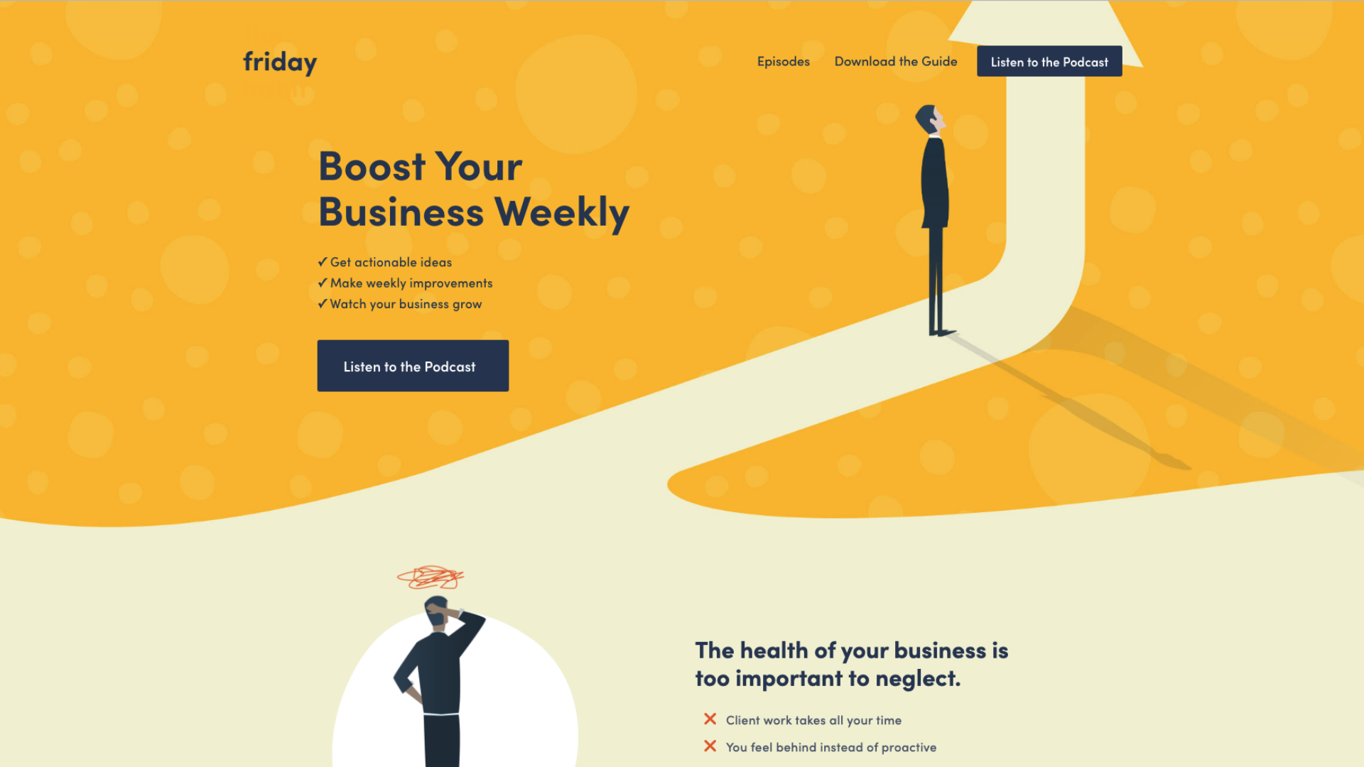
Website Builder: Squarespace
Mark Labriola II and Benjamin Manley host The Friday Habit, a podcast that encourages entrepreneurs to set aside one day of the week to improve their business with actionable ideas. It often features interviews with business professionals to get their perspectives on aspects of entrepreneurship, including building a team, resolving conflict, or implementing leadership strategies. The podcast’s website is user-friendly, offering a forward-focused, corporate-style aesthetic.
Key Takeaways:
- The podcast’s website design is expressive and appealing, with easy access to useful information.
- It links a free guidebook with business habit improvements to assist listeners while providing a call-to-action.
- Show notes are organized and heavily detailed—typically with external links and contact information.
What Could Be Improved:
- Page Structure: Include an extra section for business-related articles featuring tips or strategies for entrepreneurs who are looking for guidance on the episode’s topic.
- Website Design: An About page would better communicate the podcast’s ideas/goals.
The Installation Art Podcast

Website Builder: Hostinger
The Installation Art Podcast covers the diverse world of installation art and all the stories, challenges, and logistics associated. Accomplished installation artist Anastasia Parmson interviews other renowned artists to peek into their creative processes and personal journeys. The minimalist site design and cube-shaped logo portray a sense of physical space and openness consistent with sculpture sketches.
Key Takeaways:
- The bold aesthetic and color palette of the website is reflective of the podcast’s artistic nature.
- Links nearly a dozen podcast platforms (beyond the big three) where listeners can find and enjoy the podcast.
- Each episode has dedicated show notes, timestamps, and a quick overview of guest profiles.
What Could Be Improved:
- Site Navigability: Add a search bar that makes it easy to navigate to specific episodes in a few simple clicks.
Tree Talks Podcast
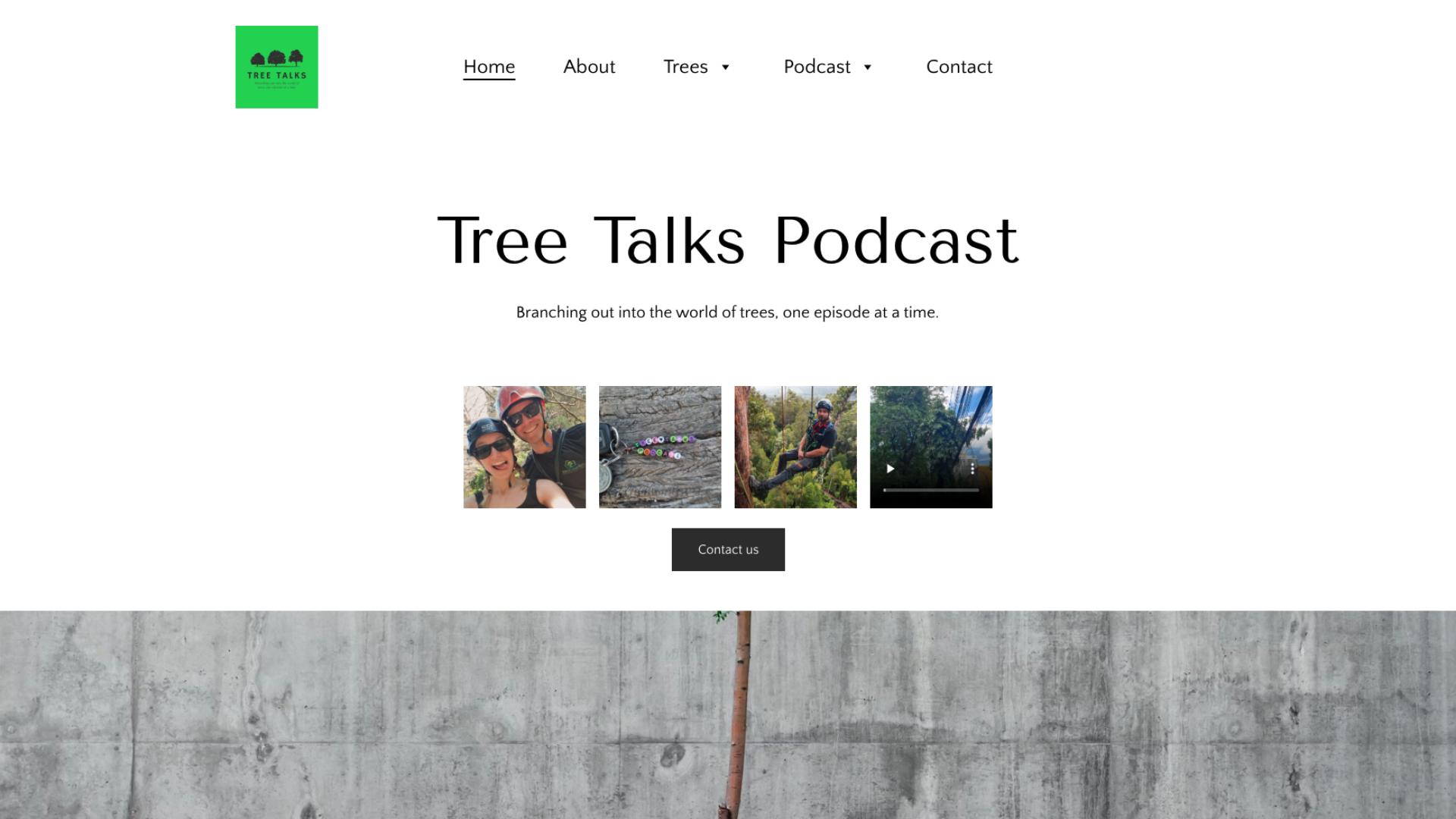
Website Builder: Hostinger
The Tree Talks Podcast, hosted by Mona, offers an informative glimpse into the often-underrated significance of trees and forests. The podcast delves into their benefits in mitigating climate change, uses in traditional medicine, and other aspects such as cultural importance and ongoing restorative efforts. The Tree Talks Podcast website is packed with useful information on trees and expresses the podcast’s natural focus.
Key Takeaways:
- Episodes are thematically divided by season—literally (Season 1: Spring, Season 2: Summer, etc.), adding a fun, natural element of organization to the site.
- Includes pages listing the benefits of trees and offering tips for urban tree care.
- Big buttons and a readable font translate to a simple, UX-friendly website design.
What Could Be Improved:
- Podcast Support: The Podcast tab only offers short descriptions with no episode links or built-in player. By adding a web podcast player, people can listen to the podcast by streaming episodes directly from the website.
Twenty Thousand Hertz
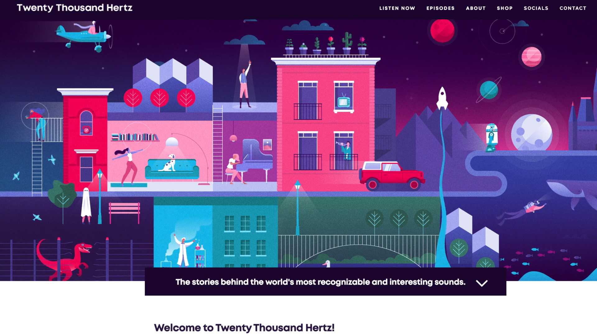
Website Builder: Squarespace
Hosted by Dallas Taylor, the Twenty Thousand Hertz podcast is a show dedicated to the auditory experiences that shape our lives. Each episode explores the stories behind some of entertainment’s most iconic jingles and why they resonate, from the Netflix Tadum to McDonald’s I’m Lovin’ It. The website features a prominent animated header that represents our living, breathing world of sound.
Key Takeaways:
- The website uniquely sorts episodes by year, subject, and emotion expressed.
- Additional content and fun games are featured, like guessing a weekly “mystery sound”—a marketing gamification tactic that can help increase a listener base and retain engagement.
- Lists press associations and accolades to provide more credibility/authority to the host’s analyses.
What Could Be Improved:
- Web Design: Twenty Thousand Hertz could employ the use of sound more on their website to reinforce the show’s theme. Including interactive elements that make noise, buttons that play jingles, a tab to play background music, etc. could be a fun addition that reinforces podcast brand identity.
Unladylike
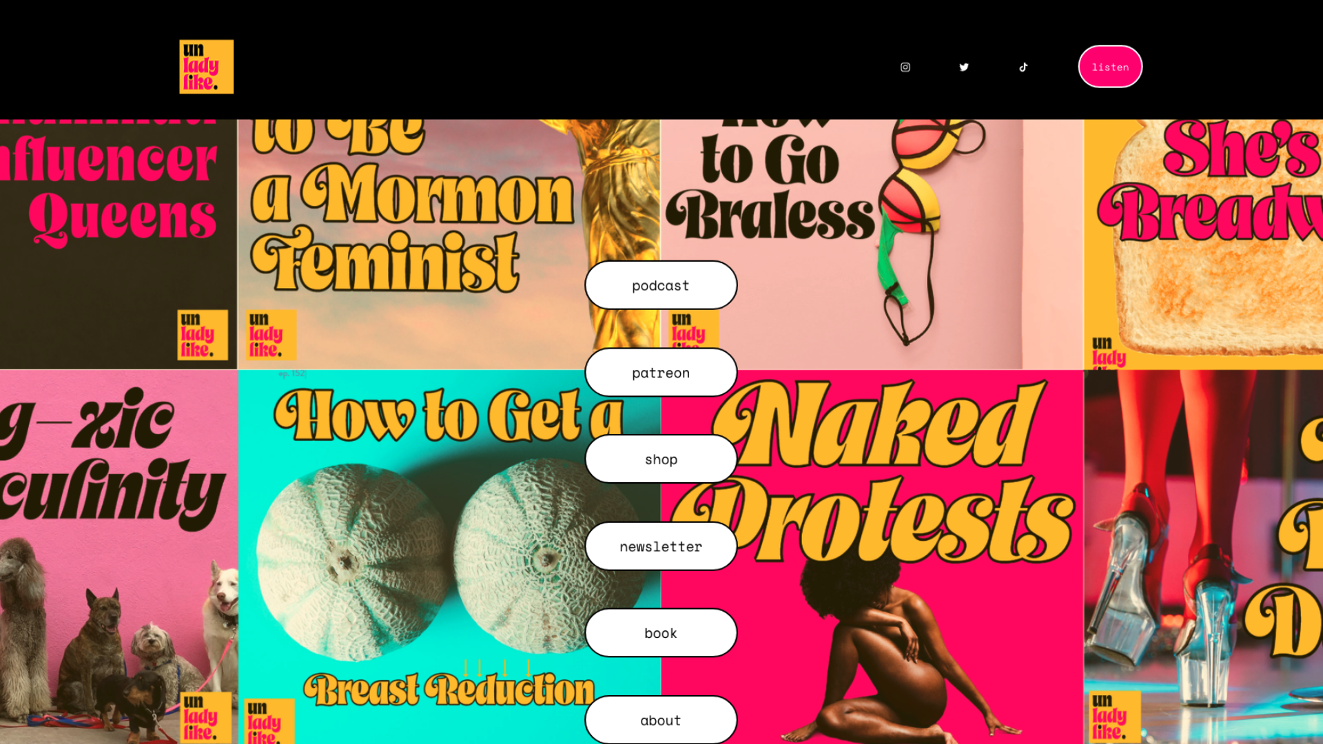
Website Builder: Squarespace
The Unladylike podcast bucks traditional notions of femininity and gender expectations. Hosted by Cristen Conger, this feminist podcast covers often-ignored lifestyle advice for women and issues related to women’s rights. The homepage is an expressive, post-modern mural decorated with covers from its episode topics.
Key Takeaways:
- A distinct, yet consistent color palette is used, along with striking visuals and bold font choices—all of which reinforces the counter-culture tone of the show.
- Episodes are categorized by searchable genres like “Advice” and “Deep Dives”.
- The homepage links monetization opportunities, including links to shops, the show’s Patreon, and a purchasable book.
What Could Be Improved:
- Content & Audience Entertainment: Include a forum or Q&A section for listeners to share their experiences, advice, or feedback with hosts.
WTF with Marc Maron Podcast
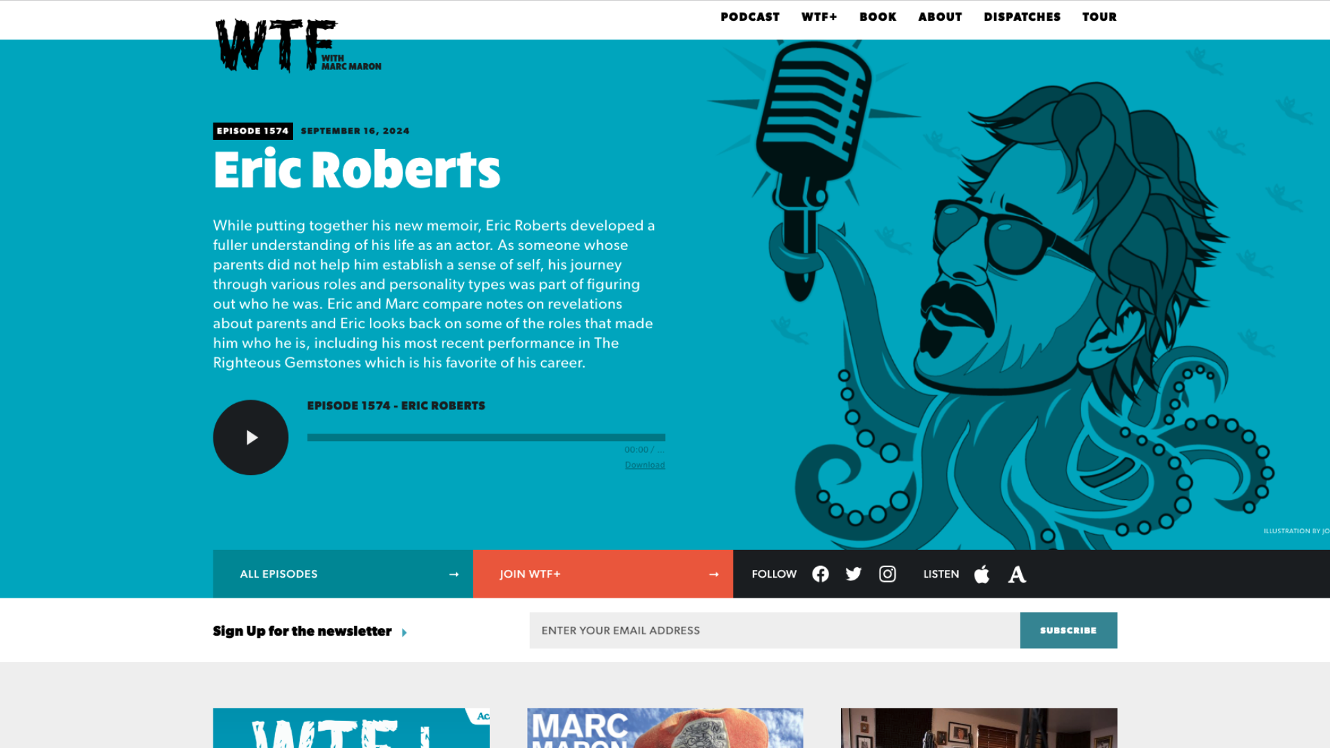
Website Builder: Squarespace
WTF is a popular podcast hosted by comedian Marc Maron, known for its candid and often deeply personal interviews with a wide array of guests, including well-known comedians, actors, authors, musicians, and more. The homepage displays a rotating selection of hand-drawn illustrations alongside an overview of the podcast’s latest episode.
Key Takeaways:
- Personal blog posts (called “Dispatches”) written by Maron are posted, keeping visitors updated with his life.
- A dedicated search bar allows visitors to search by episode number, guest, or keyword.
- Promotes “WTF+”, an option for dedicated listeners to listen ad-free with a monthly podcast subscription.
What Could Be Improved:
- Website Design: Add more searchable categories to browse the dense episode catalog.
- Page Design: Include a jump-to module that highlight a episodes with high-profile guests, particularly more recent episodes. The site currently highlights President Obama, episode 613 out of 1500+, and making this more consistent could help listeners choose which episodes they want to listen to.
Want help creating a podcast website? Hurrdat Media has podcast services including hosting, production, and advertising that can help your show’s website stand out. Check out our media network today!
The post Podcast Website Examples You’ll Want to Copy appeared first on Hurrdat Media.